Skip to content

Vivup - Visual Identity

Introduction

To us, nothing matters more than a happy workplace. We believe that’s what makes us the experts in creating them Vivup provides employers with a support network to help staff become more grounded and less stressed individuals, at work and at home

Download our Logo Pack

Need to use our logo? Here you can download a pack which includes a variety of different formats for you to use! Just remember to follow our guidelines listed below

Quick Guide

Download our quick guide to know our colour options, font preferences and logos. Please do read on the rest of our guidelines to know exactly when and where to use our assets!

Our Values

Supportive

We help each other to be the best we can be. We coach, mentor, encourage and develop our teams

Innovative

We don’t stand still. We lead the market and push the boundaries asking ‘how can we’

Focused

We have a plan. We deliver it. We focus on the ‘big rocks’ and compromise on the smaller ones

Passionate

We believe in our brand, our products and way of working

Fast Moving

We are the first to market. We don’t let others catch up

Our Mission

To be the health and wellbeing employee benefits company of choice, truly improving the lives of workersTo achieve this, we provide a flexible, fully customisable platform and an extensive range of meaningful benefits and services to the public and private sectors. In addition we provide a market-leading in-house Employee Assistance Programme and Recognition and Reward benefit

Voice & tone

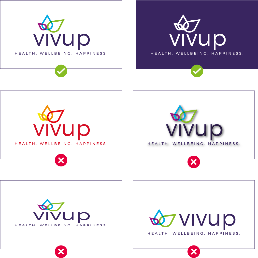
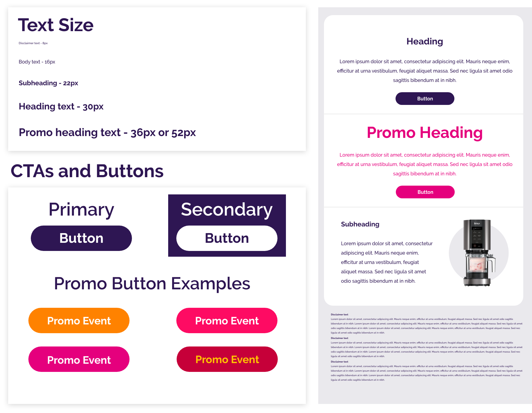
When writing copy for Vivup, it is important to use a consistent style that is informative, compliant, positive, plain-speaking and human. The audience must be considered at all times, do not presume they understand the processes associated with their benefits


Your tone might vary from message to message or touchpoint to touchpoint. And that’s ok!

Generally though, your tone should fall within the ranges here. If your tone is falling more toward either extreme (e.g. a very serious announcement, or an invite to a local ugly sweater party), this may not be the right moment to use the associate brand. Tone can also inform choices around grammar, such as using contractions to convey a more laidback attitude, or choosing periods over exclamation points to keep a message from sounding overzealous.


Voice & tone - Do & Don't

D0!

  • Use everyday language
  • Be positive and engaging
  • Keep sentences to the point
  • Avoid corporate jargon and acronyms
  • Ensure each word is necessary
  • Keep it simple and easy to understand
  • Be helpful, with a friendly approach
  • Use headings and hierarchy to break up text

D0n't!

  • Bore the reader with too much information
  • Over explain processes
  • Confuse people with jargon and financial terms
  • Overload facts, figures and examples
  • Be patronising - Use the words 'scheme' or 'allow'

Voice & Tone - The Difference

Formal

“We would like to inform you of a new health benefit available today."

Asset 6

Casual

“New perk, peeps!”

Matter-of-fact

“We are announcing a new health benefit today.”

Asset 7

Enthusiastic

“Perk up! A new health benefit is here.”

Respectful

“Your time is valuable—that’s why we’re introducing a benefit to help manage your health appointments.”

Asset 5

Irreverent

“Why is adulting so hard?! Here’s a benefit that might help.”

Serious

“Without your health, you have nothing. Use this benefit to manage your care.”

Asset 8

Funny

“No flu for you! This new benefit will help keep you healthy.”

Main Logo

Vivup CMYK No Strapline

Logo with Strapline

Asset 6-1

Logo Spacing

Clearspace around the logo should be the same as the width of the blue lotus within the Vivup logo

Spacing Logo

Do's and Don'ts

Do not edit the logo in any way. The colours must be consistent with the branding colours for digital and print outputs.


DO NOT

  • Change the colours of the logo
  • Add drop shadows or effects to the logo
  • Scale the logo disproportionally
  • Eearrange the logo in any way
Logo Dont

Our Lotus

The pictorial mark can be used above titles or within footers of a document and must only be used when the full Vivup logo is present

The pictorial mark can be used as an abstract mark as a background of a document

Lotus Both

Sub Brands

Asset 2@4x-1

Your Care

HighFive Logo

HighFive

Vivup Powered

Powered by Vivup

Vivup Gold

Vivup Gold

Vivup est

Vivup est. 2005

Vivup 15

Vivup 15

Brand Palette

Our primary colours are the 4 main colours used within the Vivup logo. The red is used as an offer splash. The gold is reserved for the Vivup Gold program

C: 96 M: 100 Y: 30 K: 19

R: 53 G: 23 B: 95

#35185F

C: 71 M: 14 Y: 3 K: 0

R: 47 G: 169 B: 221

#2FA9DD

C: 51 M: 98 Y: 5 K: 1

R: 146 G: 35 B: 127

#92237F

C: 50 M: 2 Y: 97 K: 0

R: 148 G: 190 B: 45

#94BE2D

C: 0 M: 100 Y: 70 K: 0

R: 228 G: 0 B: 58

#E4003A

C: 20 M: 20 Y: 85 K: 0

R: 216 G: 192 B: 60

#D8C03C

Colour L

Gradient Palette

Gradients that can be used in marketing collateral. Please note: when used with imagery an opacity needs to be applied (Find the % here)

C: 96 M: 100 Y: 30 K: 19

R: 53 G: 23 B: 95

#35185F


C: 71 M: 14 Y: 3 K: 0

R: 47 G: 169 B: 221

#2FA9DD

C: 71 M: 14 Y: 3 K: 0

R: 47 G: 169 B: 221

#2FA9DD


C: 51 M: 98 Y: 5 K: 1

R: 146 G: 35 B: 127

#92237F

C: 51 M: 98 Y: 5 K: 1

R: 146 G: 35 B: 127

#92237F


C: 96 M: 100 Y: 30 K: 19

R: 53 G: 23 B: 95

#35185F

C: 71 M: 14 Y: 3 K: 0

R: 47 G: 169 B: 221

#2FA9DD


C: 50 M: 2 Y: 97 K: 0

R: 148 G: 190 B: 45

#94BE2D

C: 50 M: 2 Y: 97 K: 0

R: 148 G: 190 B: 45

#94BE2D


C: 35 M: 0 Y: 50 K: 0

R: 183 G: 214 B: 155

#B7D69B

Font Family

Print & Web Font

Raleway Bold

A B C D E F G H I J K L M N O P Q R S T U V W X Y Z

Raleway Medium

A B C D E F G H I J K L M N O P Q R S T U V W X Y Z

Type Scale

40px - Header One

Raleway - Bold

Line spacing: 50px


32px - Header Two

Raleway - Bold

Line spacing: 40px


24px - Header Three

Raleway - Bold

Line spacing: 30px


16px - Header Three

Raleway - Bold

Line spacing: 20px

16px - Body One

Raleway - Medium

Line spacing: 20px


14px - Body Two

Raleway - Medium

Line spacing: 18px


12px - Body Three

Raleway - Medium

Line spacing: 16px


Exemption

16px - Button

Raleway - Medium

Colour in Typography

Title

Sub Heading

Copy - Always purple

Title

Sub Heading

Copy - Always purple

Photography

Photography Overview

The photography used in marketing collateral needs to show happy people engaging in activities related to the Vivup offering. Faces should be avoided but if this is not possible they need to be diverse showing a range of ethnicities, genders and age

Gradients and Opacities

Gradients

Vivup Icons

HE

HighFive

Car

HighFive

Travel

HighFive

Bike Shop

HighFive

Gym

HighFive

On Demand

HighFive

EAP

Employee Assistance Programme

CTW

Cycle to Work

Financial

Financial Wellbeing

R and R

Recognition

LS

HighFive

AVC Wise

AVC Wise

Product Tags

Tag

Arrangements

Communication sets we put out.

  • Bi weekly Intranet: Poster, ESR Banner, Social Media Copy
  • Exhibition banners: 6mm bleed and crop banner size is 800mm X 2200mm
  • Print posters and flyer: 3mm bleed and crop
  • Wallet cards: 2mm crop and bleed
  • Wallpapers size: 1920px X 1080px
  • ESR banners size: 1200 px X 400 px
  • Intranet banner 

Print Material

Print Poster
Artboard 3
Print Flyers
Artboard 1
Print Wallet Card
Artboard 2-1

Digital Material

Digital Poster
Artboard 4
Wallpaper
Artboard 5
ESR Banner
Artboard 6

Email Design

Email Overview

Email marketing is very important here at Vivup as it helps build our brand identity and increases our customer engagement. Following these email guidelines should come second only to using the provided email templates.

Here are the most common types of content we send by email:

  • B2C Business as usual emails (BAU) promoting events, products and covering multiple employee benefits we offer as a newsletter style email
  • Internal message emails (mainly copy minimal design)
  • Educational emails for getting the most out of existing products and features
  • Monthly newsletters
  • Automated emails such as abandoned basket and renewal emails
  • Onboarding emails
  • B2B emails
Hero main content

4 & 2 column supporting

Hero Main Template
Hero with newsletter style

Zig Zag layout (unless dynamic)

Hero newsletter template
Internal Message

1 column no images

Group 492
1 column with hero image


1 Column Hero template

Structure Guide

It is recommended email content should be structured according to an inverted pyramid model, by using a layout to guide readers on what the most important content in the email is. Our emails should be written for a distracted audience, only including the necessary content to communicate the intended message.

If a campaign requires a different layout we recommend a banner style hero image above the email fold. This will mostly apply to our B2B emails. If creating campaigns outside the provided templates, content should be in a single column layout only to assist with readability

Inverted Pyramid Layout
Inverted Pyramid
Banner Lead Style Layout
Banner Lead Style

Spacing and Sizing

Email Width

Our emails are 660 pixels wide. We set this because 660 divides nicely into 2, 3, 4, 5, 6, and 10 — and that gives us greater freedom to work with multiple columns and more complex grid layouts which our emails require at times.

Padding and Spacing

Padding and Spacing
Desktop Header
Mobile Header

Typography

Web Font - Raleway

Raleway Bold

A B C D E F G H I J K L M N O P Q R S T U V W X Y Z

Raleway Medium

A B C D E F G H I J K L M N O P Q R S T U V W X Y Z

Email Safe Font - Arial

Arial Bold

A B C D E F G H I J K L M N O P Q R S T U V W X Y Z

Arial Medium

A B C D E F G H I J K L M N O P Q R S T U V W X Y Z

Body copy in our BAU B2C emails should be center-aligned and our B2B emails, or educational type emails, should be left-aligned to help with readability on small devices. Generally you should only centre align if there’s less than 3 lines of text, but we always centre-align for our BAU B2C emails.

Group 664

Button Specifications

You must keep the following in mind when creating button for emails:

  • All email buttons should be coded as such to ensure users with images disabled are still able to see the CTA
  • Use meaningful link text rather than ‘click here’ for understanding and accessibility
  • Button text should be sentence case
  • Button widths should expand to fit their text, or be a maximum 500 pixels width

Imagery & Graphics

Hero Image

The hero image of an email is very important as it is the first visual to be seen and gives the user a glimpse of what our email is about. When it comes to emails some email clients do not render images correctly, so it is important the key message in the email is readable as live text above the fold or just underneath. Below is a guide to image sizes for desktop and mobile.

PLEASE NOTE: This is purely a guide but if a creative design requires a different size this is allowed but will need to be approved. Just make sure to be aware to keep key information above the fold.

Desktop

Desktop-Hero-Size
Desktop-Banner-Hero-Size

Mobile

Mobile-Hero-Size
Mobile-Banner-Hero-Size

Imagery

Content in images for emails should follow our photography guidelines if lifestyle imagery is required. Additionally, images used in emails should: 

Be optimised for mobile to support quick loading. GIFs recommended to be under 1MB in size

Have alt-text to communicate important visuals for accessibility purposes

Never have important messaging/words saved in the image file - if necessary use a background image with live text over the top

Product Image Examples

Circle colour - #EAE9ED

Products 1

Tagged Product

Tagged Products

Gift Cards

Cards

Layout

Desktop

Product Layout Desktop

Mobile

Product Layout Mobile

Iconography

All icons used in emails should come from our Iconography guidelines.

Colour

Standard 

R: 53 G: 23 B: 95

#35185F

This is one of the primary colours used in ours emails. It is used for all text on a white background and all primary CTA buttons.                                          

R: 146 G: 35 B: 127

#92237F

This colour can be used when necessary to highlight relevant content in our emails. It can also be used for CTA buttons and background colours.

R: 47 G: 169 B: 221

#2FA9DD

This colour can be used when necessary to highlight relevant content in our emails. It can also be used for CTA buttons and background colours.

R: 228 G: 0 B: 58

#E4003A

This colour is used to highlight special offers or prize draws. It can be used for CTA buttons, text and background colours.                               

EAP 

R: 250 G: 253 B: 239

#FAFDEF

For EAP emails use this background colour for banners and text blocks.

Keep the base text colour as #35185F and headlines or sub-headers as #94BE2D

R: 148 G: 190 B: 45

#94BE2D

Use this colour for background colours when necessary or CTA buttons.

Make sure text colour is #001F05                                                                                                                                                    

Gradient Fallback Colours

When using our branded gradient colours as background images, please make sure to use the following colours as fallbacks for email clients that do not support background colours.

Group 612
Group 613
Group 614
Group 615
Group 616
Group 617
Group 618
Group 619
Group 620
Group 621
Neutrals

R: 234 G: 233 B: 237

#EAE9ED

Colour used for footer background and general colour surrounding email

R: 240 G: 240 B: 240

#F0F0F0

This colour is used as a background to break up sections in an email

R: 248 G: 249 B: 252

#F8F9FC

This colour is used as a background to group HE icons together

Need more info?

Email us :)

creative@vivup.co.uk